L3 OPENING SEQUENCE - GROUP 1 - FINAL VIDEO from cmdiploma on Vimeo.
Monday 16 November 2009
EVALUATION ACTIVITY ONE.
In what ways does your media product use, develop or challenge forms and conventions of real media products? (i.e. of film openings)
Here is a 9 frame grid for my film opening 'Something Wicked'. 

The nine frame grid shows shots I feel best represents what I was trying to achieve.
Frame 1
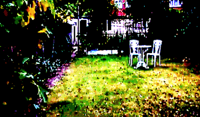
This is the first shot that appears on screen (excluding the production logos). It is the establishing shot which sets the scene and builds up the tension, as the audience may be wondering where the location is and what relevance it has. to the film.
Frame 2
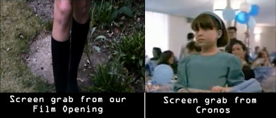
Frame 2 is shot through a green house window, and shows leg shots of a girl walking along the garden path. I particularly like this shot as its unusual and makes it look like the girl is being watched.Frame 3
This shot is a close up of the shed door, I think the rusty pad lock adds to the effect of the film opening and creates an uncertainty of what might be inside. It also has a contrast of the colours used in the rest of the opening, as later shots become darker.
Frame 4
This frame shows where the Main title comes in. We used decorative/eroded/old styled font called Kingjola, from dafont.com. This is a common font type to have in supernatural thrillers, as I found out whilst planning and looking at exsisting film openings such as Rosemary's baby,where such font is used. In Final Cut Express we added effects to the main title which included, Gaussian Blur, Earthquake and Directional which makes it shake about on the screen, which I feel really adds to the atmosphere.
Frame 5
Tracking shot of the props provided inside the location.
Giving the feel that the audience doesn't really know what's going on.
Giving the feel that the audience doesn't really know what's going on.
Frame 6
I used this frame as it is a good example of the font style used and it also shows how we gave credit to the composer of our soundtrack.
Frame 7
I used this frame because it shows the opening has gotten lighter compared to the rest inside, also it is the beginning of the hand sequence.
Frame 8
This shot is of the final filmed scene in our opening, it also shows that the character's hands are in view now and has found the significant object, the book.
Sunday 15 November 2009
EVALUATION ACTIVITY TWO.
How does your media product represent particular social groups?
The ways these characters are similar to eachother is because the character in our film is also discovering the significant object of the film, which is a book with the lettering 'WS'(Backwards for the film title, Something Wicked) which will later lead to supernatural, mystical events in our film.
Our film opening has no introduction to characters as such and only hand and legs shots are shown of the main character. This was
However I would compare this character to the little girl in the film Cronos (Del Toro, 1992)
The reason why I find these two character's similar are because in Cronos, Mercedes, the little girl, co-finds the significant object with her grandfather in the film, which leads to the main storyline of the film where the pincers of the object stab her grandfather transforming him into a mystical creature, craving the need of human blood.
The reason why I find these two character's similar are because in Cronos, Mercedes, the little girl, co-finds the significant object with her grandfather in the film, which leads to the main storyline of the film where the pincers of the object stab her grandfather transforming him into a mystical creature, craving the need of human blood.

The ways these characters are similar to eachother is because the character in our film is also discovering the significant object of the film, which is a book with the lettering 'WS'(Backwards for the film title, Something Wicked) which will later lead to supernatural, mystical events in our film.
Saturday 14 November 2009
EVALUATION ACTIVITY THREE.
What kind of media institution might distribute your media product and why?
Here is our Film Opening sequence with a voiceover talking about production and influences for the project.
Friday 13 November 2009
EVALUATION ACTIVITY FOUR.
Who would be the audience for your media product?
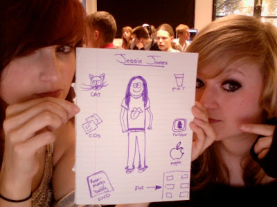
Here is an example of the type of person who would watch our film.
Her name is Jesse James and 24 years old, she lives in a flat and enjoys social networking sites, especially twitter. She is a university student therefore she owns a Macbook and enjoys networking with friends aswell as studying on it.
She likes to have a drink at the pub with her friends when she isn't busy studying and also spends most her money on a low budget for food and drink and spends the rest on indie CD's and universal cinema DVD's.
She prefers to watch a film at the cinema, by herself or with friends and her favourite tv channel is Film4 aswell as E4.
She doesn't wear anything out of the ordinary, just a simple band tee and skinnies.
Her favourite tv programmes are Charmed and Buffy the Vampire Slayer re-runs(They both have a supernatural feel) also Friends and Scrubs- typicial american comedy.
She has grown quite fond to the new supernatural tb programmes out at the moment such as True Blood, Ghost Whisperer and also Supernatural.
Her favourite genre of film is obviously Supernatural Thriller and Horror.
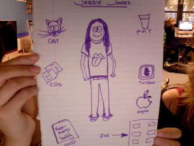
Here is a clearer picture of our target audience.
Thursday 12 November 2009
EVALUATION ACTIVITY FIVE.
How did you attract/address your audience?
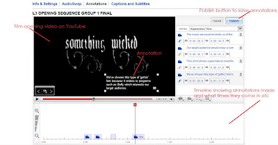
The ways in which we can attract the audience is using annotations on the video we uploaded to youtube.
This involves adding captions onto a timeline at the bottom of the screen explaining why we used certain features and/or comparing what we've done to other aspects in media, for example our font is quite similar to Buffy The Vampire Slayer's opening title fonts.
[video w/ annos]
The ways in which we can attract the audience is using annotations on the video we uploaded to youtube.
This involves adding captions onto a timeline at the bottom of the screen explaining why we used certain features and/or comparing what we've done to other aspects in media, for example our font is quite similar to Buffy The Vampire Slayer's opening title fonts.

[video w/ annos]
Tuesday 10 November 2009
EVALUATION ACTIVITY SIX.
What have you learnt about technologies from the process of constructing this product?
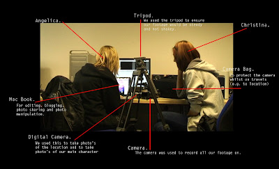
In the picture above, it shows Christina and I surrounded by the equipment we used to complete our film opening.
You can click the picture for a bigger size which is easier to read.
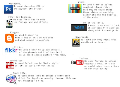
Again, in the picture above, it annotates the different programs, online and off, which we used during the process of producing our opening sequence- it also includes what we used for the comic book opening which unfortunately couldn't be completed in time due to technical difficulties.
Like the one above, you may click the picture for a larger view.
Saturday 7 November 2009
Script for Voice Over commentary
Angelica: Hello I'm Angelica
Christina: and I'm Christina, we produced and directed the opening to ‘Something Wicked’
Angelica: The production logo’s at the beginning of the video represent the funding and creation of this film. Long Road sixth form college was the funder and distributor of the film donating around £40,000 for us to work with. Underwater Cow and Jellycar productions were the producer companies we used.
Christina: Other possible funding for our film could have come from the BBC microwave project. The microwave project is for London-based companies to produce ten micro-budget feature films over a three year period. Another funder or distributor in mind was film-four.
Angelica: The titles in the film opening appear in order so that the more important titles come in last. ‘Something Wicked’ appears when the soundtrack becomes more sinister which is effective because it highlights the importance of the title.
Christina: Two film openings that reflect supernatural conventions that we had looked at are Rosemary’s baby and To Kill a Mockingbird. These films influenced us in different ways, in particular the style of font used and the soundtracks.
Angelica: Rosemary’s Baby was produced by William Castle productions and was distributed by Paramount Pictures, however To Kill a Mockingbird was produced by Brentwood productions and distributed by Universal Pictures. This shows how there is a variety of producers and distributors in the thriller genre.
Christina: The certificate we advise the film to be set as is a 15. This is because of the supernatural thriller aspects of the film, which would not be suitable for young people.
Friday 6 November 2009
Certificate
I went on the SBBFC to look at certificates for films.
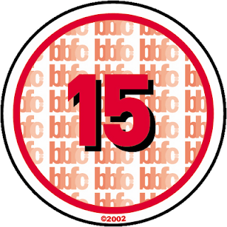
This talks about what makes a film a certain certificate.
Under the category '15' it states:
What sort of issues might I find in a ‘15’ film, DVD or video game?
‘15’ works are stronger than '12' or ‘12A’ rated works and could include any of the following:
• strong violence
• frequent strong language (eg 'f***').
• portrayals of sexual activity
• strong verbal references to sex
• sexual nudity
• brief scenes of sexual violence or verbal references to sexual violence
• discriminatory language or behaviour
• drug taking
Occasionally there may be uses of the strongest terms (eg 'c***'), although continued aggressive use will not normally be passed at ‘15’. For more detailed information on the ‘15’ category click here to read the BBFC guidelines
What about horror works?
At’15’ there can be strong threat and menace (as long as it is not sadistic or sexualised), although the strongest gory images are unlikely to be acceptable.
I think this relates to my film opening and I would therefore give it the certificate 15.

Thursday 5 November 2009
Finding Text Examples.
In today's lesson I have been working a bit on the comic life program producing more images of the character and also discovering the different font effects I could use.
Unfortunately, the location shots on Christina's blog which I was going to use are too small compared to the images I created earlier, therefore I am unable to get the whole picture to be the correct size without the background going pixelated.
Instead, I decided to check out what type of fonts are available, the application provides you the option to change the colours used within the font.
Here's an example;
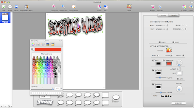
In this screengrab, you can see the choices this program gives you and also the chosen font I selected.
Wednesday 4 November 2009
Creative Risk.
Mine and Christina's risk would be the fact we are doing two openings, one abstract, the other comic.
We are still using the same story and they do link to each other.
So far this idea is working well and I think both openings will be equally as good.
The benefits of doing this are we can both do what we want and also help each other out with each opening- because we are both doing two film openings, I think this might give us both a better mark in our overall grade.
Although, what may of happened is that we do not complete the sequences in time because it's just too much or one overshadows the other. Christina may of said she wouldn't join me in this so we would both me doing our openings separately, but fortunately we both agreed to doing two and helping one another out with our projects.
Tuesday 3 November 2009
Editing for Comic.
In today's lesson, I converted the pictures I took yesterday to Photoshop, where I erased the backgrounds using the magic pen tool and also the eraser.
I realised when doing this, that I should've chosen a better location to take these shots, since it was hard to delete the background.

Original Picture.
[no background picture here.]
Once I had erased the backgrounds to all the photos, I uploaded them to Comic Life to see what effect would work well with the pictures and the sequence.
Once uploaded, the program gives the option at the top to change the style- I chose the 'Syn City' effect, then clicked on Details, which lets you edit the picture in more detail. Christina and I went through all of the different filters until we found one suitable, Drawn Monotone.
This is how it turned out in the end- I think it looks really good and gives a great comic effect.
Christina and I agreed that instead of the dull background, we used a screengrab from our abstract opening instead. To do this, I went on to Final Cut Express and took a screengrab of the first establishing shot in the sequence.
I then uploaded the picture on to Photoshop and made the saturation and contrast a lot more vibrant, I then used the film grain filter which makes the image have a printed effect- like a comic.

Once I had completed this, I pasted the image I edited on comic life on to the establishing shot edit and erased all of the background around our character, except a white border, otherwise I think she would've blended in with the background too much when she needs to stand out. I kept the background in colour and the character in greyscale to have an unusual feel to the sequence.
Here is my finished edit:
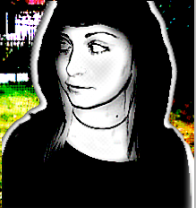
I think the character really stands out, and has the 'Sin City' feel I wanted with the monotone and slightly coloured background.
I'm not too sure whether to still go with the Black, white and red theme, as I find this type of shot looks effective.
I realised when doing this, that I should've chosen a better location to take these shots, since it was hard to delete the background.

Original Picture.
[no background picture here.]
Once I had erased the backgrounds to all the photos, I uploaded them to Comic Life to see what effect would work well with the pictures and the sequence.
Once uploaded, the program gives the option at the top to change the style- I chose the 'Syn City' effect, then clicked on Details, which lets you edit the picture in more detail. Christina and I went through all of the different filters until we found one suitable, Drawn Monotone.

This is how it turned out in the end- I think it looks really good and gives a great comic effect.
Christina and I agreed that instead of the dull background, we used a screengrab from our abstract opening instead. To do this, I went on to Final Cut Express and took a screengrab of the first establishing shot in the sequence.
I then uploaded the picture on to Photoshop and made the saturation and contrast a lot more vibrant, I then used the film grain filter which makes the image have a printed effect- like a comic.

Once I had completed this, I pasted the image I edited on comic life on to the establishing shot edit and erased all of the background around our character, except a white border, otherwise I think she would've blended in with the background too much when she needs to stand out. I kept the background in colour and the character in greyscale to have an unusual feel to the sequence.
Here is my finished edit:

I think the character really stands out, and has the 'Sin City' feel I wanted with the monotone and slightly coloured background.
I'm not too sure whether to still go with the Black, white and red theme, as I find this type of shot looks effective.
Monday 2 November 2009
Shots of Character.
During Half term, I have been practicing using the programme Comic Life, unfortunately my Vista doesn't seem to like it very much and keeps crashing, this problem never occurred on the macs.
However, I have managed to take some 'introduction' shots of our main character in the title sequence, my friend kindly volunteered to do it so I took a few snaps of her looking like she is walking along, also making it seem like she is looking for something. Of course my friend isn't an A* drama student, so the shots are kind of bland, but hopefully using photoshop and also comic life, I'll be able to edit these correctly tomorrow, to make them seem more realistic and not so wooden.
As I don't have Photoshop on my desktop at home, I tried using Photobucket to edit the photographs, I have never tried this before and I highly doubt I will try again, it makes the photo seem messy and won't do what you want it to do, unlike Photoshop.
A few unedited shots:

This is an example of a shot I won't be using, my model's hoop earrings are in view which does not go with the sequence, as she is meant to represent a school girl.
Also, she is slightly smirking in this picture.

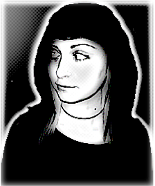
This shot is one of my favourites, it really focuses on her features and it has the effect that she is curious to what might be going on, completely relevant to our film opening- great shot for an introduction to the character.

Another photo I quite like, although her facial expression isn't really what I wanted, I find the low angle works well, gives a 'Blair Witch' feel to our piece.
Obviously, I will be editing out the backgrounds when I get to Coleridge to blank white or black, depending on what works best with each shot.
However, I have managed to take some 'introduction' shots of our main character in the title sequence, my friend kindly volunteered to do it so I took a few snaps of her looking like she is walking along, also making it seem like she is looking for something. Of course my friend isn't an A* drama student, so the shots are kind of bland, but hopefully using photoshop and also comic life, I'll be able to edit these correctly tomorrow, to make them seem more realistic and not so wooden.
As I don't have Photoshop on my desktop at home, I tried using Photobucket to edit the photographs, I have never tried this before and I highly doubt I will try again, it makes the photo seem messy and won't do what you want it to do, unlike Photoshop.
A few unedited shots:

This is an example of a shot I won't be using, my model's hoop earrings are in view which does not go with the sequence, as she is meant to represent a school girl.
Also, she is slightly smirking in this picture.

This shot is one of my favourites, it really focuses on her features and it has the effect that she is curious to what might be going on, completely relevant to our film opening- great shot for an introduction to the character.

Another photo I quite like, although her facial expression isn't really what I wanted, I find the low angle works well, gives a 'Blair Witch' feel to our piece.
Obviously, I will be editing out the backgrounds when I get to Coleridge to blank white or black, depending on what works best with each shot.
Sunday 1 November 2009
Feedback for Crooks and Bones.
L3 - GROUP 4 (Elliott, Matt & Rob) Film Opening Rough Cut from cmdiploma on Vimeo.
For the feedback task, we had to look at Rob/Elliott/Max's piece, 'Crooks and Bones'.
The strengths I find in this are the camera work, angles, and editing.
The weaknesses however, the fisheye- I find that it was over used, sometimes it worked really well with the flow of the sequence Eg/ in the car, but at other times it just didn't work, Eg/ in the house.
I realise that this group didn't have much time for editing although what they have come up with works great, it just needs a soundtrack and that 'extra shot.'
I'm not too sure where the titles will fit in though.
Their sequence reminds me a lot of something the director Guy Richie would do, in the scene with the beds, cigarette in the ashtray- clock, I think that Richie's fast action movement would work very well, as seen in Snatch, on this scene.
I'm not too sure what the storyline is however, it may just be too complicated for me.
I am however very curious of what their soundtrack is like- I'm not too sure whether it should be fast pace, like a Guy Richie film, or a smooth score, like The Godfather's.
I think once the sequence is completed, it will look professional and hopefully get the marks it deserves.
Subscribe to:
Posts (Atom)