L3 OPENING SEQUENCE - GROUP 1 - FINAL VIDEO from cmdiploma on Vimeo.
Monday 16 November 2009
EVALUATION ACTIVITY ONE.
In what ways does your media product use, develop or challenge forms and conventions of real media products? (i.e. of film openings)
Here is a 9 frame grid for my film opening 'Something Wicked'. 

The nine frame grid shows shots I feel best represents what I was trying to achieve.
Frame 1
This is the first shot that appears on screen (excluding the production logos). It is the establishing shot which sets the scene and builds up the tension, as the audience may be wondering where the location is and what relevance it has. to the film.
Frame 2
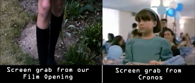
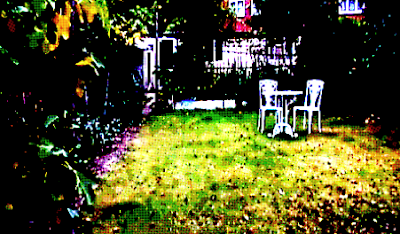
Frame 2 is shot through a green house window, and shows leg shots of a girl walking along the garden path. I particularly like this shot as its unusual and makes it look like the girl is being watched.Frame 3
This shot is a close up of the shed door, I think the rusty pad lock adds to the effect of the film opening and creates an uncertainty of what might be inside. It also has a contrast of the colours used in the rest of the opening, as later shots become darker.
Frame 4
This frame shows where the Main title comes in. We used decorative/eroded/old styled font called Kingjola, from dafont.com. This is a common font type to have in supernatural thrillers, as I found out whilst planning and looking at exsisting film openings such as Rosemary's baby,where such font is used. In Final Cut Express we added effects to the main title which included, Gaussian Blur, Earthquake and Directional which makes it shake about on the screen, which I feel really adds to the atmosphere.
Frame 5
Tracking shot of the props provided inside the location.
Giving the feel that the audience doesn't really know what's going on.
Giving the feel that the audience doesn't really know what's going on.
Frame 6
I used this frame as it is a good example of the font style used and it also shows how we gave credit to the composer of our soundtrack.
Frame 7
I used this frame because it shows the opening has gotten lighter compared to the rest inside, also it is the beginning of the hand sequence.
Frame 8
This shot is of the final filmed scene in our opening, it also shows that the character's hands are in view now and has found the significant object, the book.
Sunday 15 November 2009
EVALUATION ACTIVITY TWO.
How does your media product represent particular social groups?
The ways these characters are similar to eachother is because the character in our film is also discovering the significant object of the film, which is a book with the lettering 'WS'(Backwards for the film title, Something Wicked) which will later lead to supernatural, mystical events in our film.
Our film opening has no introduction to characters as such and only hand and legs shots are shown of the main character. This was
However I would compare this character to the little girl in the film Cronos (Del Toro, 1992)
The reason why I find these two character's similar are because in Cronos, Mercedes, the little girl, co-finds the significant object with her grandfather in the film, which leads to the main storyline of the film where the pincers of the object stab her grandfather transforming him into a mystical creature, craving the need of human blood.
The reason why I find these two character's similar are because in Cronos, Mercedes, the little girl, co-finds the significant object with her grandfather in the film, which leads to the main storyline of the film where the pincers of the object stab her grandfather transforming him into a mystical creature, craving the need of human blood.

The ways these characters are similar to eachother is because the character in our film is also discovering the significant object of the film, which is a book with the lettering 'WS'(Backwards for the film title, Something Wicked) which will later lead to supernatural, mystical events in our film.
Saturday 14 November 2009
EVALUATION ACTIVITY THREE.
What kind of media institution might distribute your media product and why?
Here is our Film Opening sequence with a voiceover talking about production and influences for the project.
Friday 13 November 2009
EVALUATION ACTIVITY FOUR.
Who would be the audience for your media product?
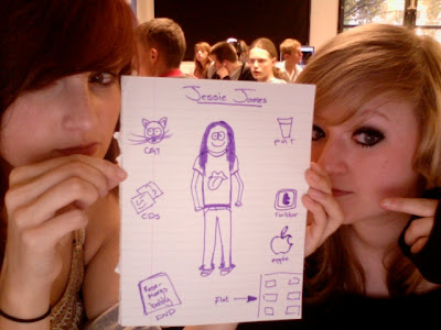
Here is an example of the type of person who would watch our film.
Her name is Jesse James and 24 years old, she lives in a flat and enjoys social networking sites, especially twitter. She is a university student therefore she owns a Macbook and enjoys networking with friends aswell as studying on it.
She likes to have a drink at the pub with her friends when she isn't busy studying and also spends most her money on a low budget for food and drink and spends the rest on indie CD's and universal cinema DVD's.
She prefers to watch a film at the cinema, by herself or with friends and her favourite tv channel is Film4 aswell as E4.
She doesn't wear anything out of the ordinary, just a simple band tee and skinnies.
Her favourite tv programmes are Charmed and Buffy the Vampire Slayer re-runs(They both have a supernatural feel) also Friends and Scrubs- typicial american comedy.
She has grown quite fond to the new supernatural tb programmes out at the moment such as True Blood, Ghost Whisperer and also Supernatural.
Her favourite genre of film is obviously Supernatural Thriller and Horror.
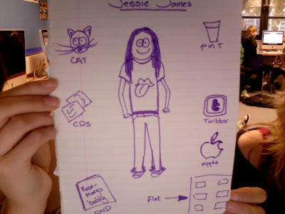
Here is a clearer picture of our target audience.
Thursday 12 November 2009
EVALUATION ACTIVITY FIVE.
How did you attract/address your audience?
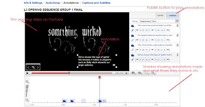
The ways in which we can attract the audience is using annotations on the video we uploaded to youtube.
This involves adding captions onto a timeline at the bottom of the screen explaining why we used certain features and/or comparing what we've done to other aspects in media, for example our font is quite similar to Buffy The Vampire Slayer's opening title fonts.
[video w/ annos]
The ways in which we can attract the audience is using annotations on the video we uploaded to youtube.
This involves adding captions onto a timeline at the bottom of the screen explaining why we used certain features and/or comparing what we've done to other aspects in media, for example our font is quite similar to Buffy The Vampire Slayer's opening title fonts.

[video w/ annos]
Tuesday 10 November 2009
EVALUATION ACTIVITY SIX.
What have you learnt about technologies from the process of constructing this product?
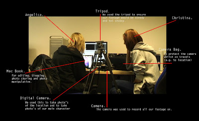
In the picture above, it shows Christina and I surrounded by the equipment we used to complete our film opening.
You can click the picture for a bigger size which is easier to read.
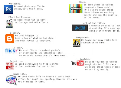
Again, in the picture above, it annotates the different programs, online and off, which we used during the process of producing our opening sequence- it also includes what we used for the comic book opening which unfortunately couldn't be completed in time due to technical difficulties.
Like the one above, you may click the picture for a larger view.
Saturday 7 November 2009
Script for Voice Over commentary
Angelica: Hello I'm Angelica
Christina: and I'm Christina, we produced and directed the opening to ‘Something Wicked’
Angelica: The production logo’s at the beginning of the video represent the funding and creation of this film. Long Road sixth form college was the funder and distributor of the film donating around £40,000 for us to work with. Underwater Cow and Jellycar productions were the producer companies we used.
Christina: Other possible funding for our film could have come from the BBC microwave project. The microwave project is for London-based companies to produce ten micro-budget feature films over a three year period. Another funder or distributor in mind was film-four.
Angelica: The titles in the film opening appear in order so that the more important titles come in last. ‘Something Wicked’ appears when the soundtrack becomes more sinister which is effective because it highlights the importance of the title.
Christina: Two film openings that reflect supernatural conventions that we had looked at are Rosemary’s baby and To Kill a Mockingbird. These films influenced us in different ways, in particular the style of font used and the soundtracks.
Angelica: Rosemary’s Baby was produced by William Castle productions and was distributed by Paramount Pictures, however To Kill a Mockingbird was produced by Brentwood productions and distributed by Universal Pictures. This shows how there is a variety of producers and distributors in the thriller genre.
Christina: The certificate we advise the film to be set as is a 15. This is because of the supernatural thriller aspects of the film, which would not be suitable for young people.
Friday 6 November 2009
Certificate
I went on the SBBFC to look at certificates for films.
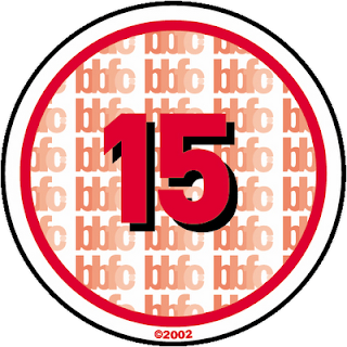
This talks about what makes a film a certain certificate.
Under the category '15' it states:
What sort of issues might I find in a ‘15’ film, DVD or video game?
‘15’ works are stronger than '12' or ‘12A’ rated works and could include any of the following:
• strong violence
• frequent strong language (eg 'f***').
• portrayals of sexual activity
• strong verbal references to sex
• sexual nudity
• brief scenes of sexual violence or verbal references to sexual violence
• discriminatory language or behaviour
• drug taking
Occasionally there may be uses of the strongest terms (eg 'c***'), although continued aggressive use will not normally be passed at ‘15’. For more detailed information on the ‘15’ category click here to read the BBFC guidelines
What about horror works?
At’15’ there can be strong threat and menace (as long as it is not sadistic or sexualised), although the strongest gory images are unlikely to be acceptable.
I think this relates to my film opening and I would therefore give it the certificate 15.

Thursday 5 November 2009
Finding Text Examples.
In today's lesson I have been working a bit on the comic life program producing more images of the character and also discovering the different font effects I could use.
Unfortunately, the location shots on Christina's blog which I was going to use are too small compared to the images I created earlier, therefore I am unable to get the whole picture to be the correct size without the background going pixelated.
Instead, I decided to check out what type of fonts are available, the application provides you the option to change the colours used within the font.
Here's an example;
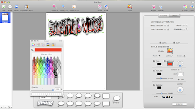
In this screengrab, you can see the choices this program gives you and also the chosen font I selected.
Wednesday 4 November 2009
Creative Risk.
Mine and Christina's risk would be the fact we are doing two openings, one abstract, the other comic.
We are still using the same story and they do link to each other.
So far this idea is working well and I think both openings will be equally as good.
The benefits of doing this are we can both do what we want and also help each other out with each opening- because we are both doing two film openings, I think this might give us both a better mark in our overall grade.
Although, what may of happened is that we do not complete the sequences in time because it's just too much or one overshadows the other. Christina may of said she wouldn't join me in this so we would both me doing our openings separately, but fortunately we both agreed to doing two and helping one another out with our projects.
Tuesday 3 November 2009
Editing for Comic.
In today's lesson, I converted the pictures I took yesterday to Photoshop, where I erased the backgrounds using the magic pen tool and also the eraser.
I realised when doing this, that I should've chosen a better location to take these shots, since it was hard to delete the background.

Original Picture.
[no background picture here.]
Once I had erased the backgrounds to all the photos, I uploaded them to Comic Life to see what effect would work well with the pictures and the sequence.
Once uploaded, the program gives the option at the top to change the style- I chose the 'Syn City' effect, then clicked on Details, which lets you edit the picture in more detail. Christina and I went through all of the different filters until we found one suitable, Drawn Monotone.
This is how it turned out in the end- I think it looks really good and gives a great comic effect.
Christina and I agreed that instead of the dull background, we used a screengrab from our abstract opening instead. To do this, I went on to Final Cut Express and took a screengrab of the first establishing shot in the sequence.
I then uploaded the picture on to Photoshop and made the saturation and contrast a lot more vibrant, I then used the film grain filter which makes the image have a printed effect- like a comic.

Once I had completed this, I pasted the image I edited on comic life on to the establishing shot edit and erased all of the background around our character, except a white border, otherwise I think she would've blended in with the background too much when she needs to stand out. I kept the background in colour and the character in greyscale to have an unusual feel to the sequence.
Here is my finished edit:
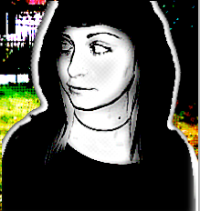
I think the character really stands out, and has the 'Sin City' feel I wanted with the monotone and slightly coloured background.
I'm not too sure whether to still go with the Black, white and red theme, as I find this type of shot looks effective.
I realised when doing this, that I should've chosen a better location to take these shots, since it was hard to delete the background.

Original Picture.
[no background picture here.]
Once I had erased the backgrounds to all the photos, I uploaded them to Comic Life to see what effect would work well with the pictures and the sequence.
Once uploaded, the program gives the option at the top to change the style- I chose the 'Syn City' effect, then clicked on Details, which lets you edit the picture in more detail. Christina and I went through all of the different filters until we found one suitable, Drawn Monotone.

This is how it turned out in the end- I think it looks really good and gives a great comic effect.
Christina and I agreed that instead of the dull background, we used a screengrab from our abstract opening instead. To do this, I went on to Final Cut Express and took a screengrab of the first establishing shot in the sequence.
I then uploaded the picture on to Photoshop and made the saturation and contrast a lot more vibrant, I then used the film grain filter which makes the image have a printed effect- like a comic.

Once I had completed this, I pasted the image I edited on comic life on to the establishing shot edit and erased all of the background around our character, except a white border, otherwise I think she would've blended in with the background too much when she needs to stand out. I kept the background in colour and the character in greyscale to have an unusual feel to the sequence.
Here is my finished edit:

I think the character really stands out, and has the 'Sin City' feel I wanted with the monotone and slightly coloured background.
I'm not too sure whether to still go with the Black, white and red theme, as I find this type of shot looks effective.
Monday 2 November 2009
Shots of Character.
During Half term, I have been practicing using the programme Comic Life, unfortunately my Vista doesn't seem to like it very much and keeps crashing, this problem never occurred on the macs.
However, I have managed to take some 'introduction' shots of our main character in the title sequence, my friend kindly volunteered to do it so I took a few snaps of her looking like she is walking along, also making it seem like she is looking for something. Of course my friend isn't an A* drama student, so the shots are kind of bland, but hopefully using photoshop and also comic life, I'll be able to edit these correctly tomorrow, to make them seem more realistic and not so wooden.
As I don't have Photoshop on my desktop at home, I tried using Photobucket to edit the photographs, I have never tried this before and I highly doubt I will try again, it makes the photo seem messy and won't do what you want it to do, unlike Photoshop.
A few unedited shots:

This is an example of a shot I won't be using, my model's hoop earrings are in view which does not go with the sequence, as she is meant to represent a school girl.
Also, she is slightly smirking in this picture.

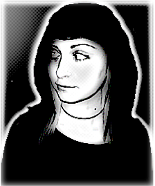
This shot is one of my favourites, it really focuses on her features and it has the effect that she is curious to what might be going on, completely relevant to our film opening- great shot for an introduction to the character.

Another photo I quite like, although her facial expression isn't really what I wanted, I find the low angle works well, gives a 'Blair Witch' feel to our piece.
Obviously, I will be editing out the backgrounds when I get to Coleridge to blank white or black, depending on what works best with each shot.
However, I have managed to take some 'introduction' shots of our main character in the title sequence, my friend kindly volunteered to do it so I took a few snaps of her looking like she is walking along, also making it seem like she is looking for something. Of course my friend isn't an A* drama student, so the shots are kind of bland, but hopefully using photoshop and also comic life, I'll be able to edit these correctly tomorrow, to make them seem more realistic and not so wooden.
As I don't have Photoshop on my desktop at home, I tried using Photobucket to edit the photographs, I have never tried this before and I highly doubt I will try again, it makes the photo seem messy and won't do what you want it to do, unlike Photoshop.
A few unedited shots:

This is an example of a shot I won't be using, my model's hoop earrings are in view which does not go with the sequence, as she is meant to represent a school girl.
Also, she is slightly smirking in this picture.

This shot is one of my favourites, it really focuses on her features and it has the effect that she is curious to what might be going on, completely relevant to our film opening- great shot for an introduction to the character.

Another photo I quite like, although her facial expression isn't really what I wanted, I find the low angle works well, gives a 'Blair Witch' feel to our piece.
Obviously, I will be editing out the backgrounds when I get to Coleridge to blank white or black, depending on what works best with each shot.
Sunday 1 November 2009
Feedback for Crooks and Bones.
L3 - GROUP 4 (Elliott, Matt & Rob) Film Opening Rough Cut from cmdiploma on Vimeo.
For the feedback task, we had to look at Rob/Elliott/Max's piece, 'Crooks and Bones'.
The strengths I find in this are the camera work, angles, and editing.
The weaknesses however, the fisheye- I find that it was over used, sometimes it worked really well with the flow of the sequence Eg/ in the car, but at other times it just didn't work, Eg/ in the house.
I realise that this group didn't have much time for editing although what they have come up with works great, it just needs a soundtrack and that 'extra shot.'
I'm not too sure where the titles will fit in though.
Their sequence reminds me a lot of something the director Guy Richie would do, in the scene with the beds, cigarette in the ashtray- clock, I think that Richie's fast action movement would work very well, as seen in Snatch, on this scene.
I'm not too sure what the storyline is however, it may just be too complicated for me.
I am however very curious of what their soundtrack is like- I'm not too sure whether it should be fast pace, like a Guy Richie film, or a smooth score, like The Godfather's.
I think once the sequence is completed, it will look professional and hopefully get the marks it deserves.
Tuesday 20 October 2009
Rough Cut.
This is the rough cut of our Abstract film opening for 'Something Wicked'.
Because it is uploaded under youtube settings, the video has lost its HD sharpness and also isn't as clear, however when it came to giving feedback the audience felt like it added a good effect to our final piece.
Re-shooting
Christina and I both felt that we really needed to re-shoot the ending hand sequence where the character is searching for the significant object(The Book) because the original camera work wasn't very clear and steady and didn't really show that the book is meant to be important- also the mise en scene wasn't well prepared.
We went out to film in the middle of the day- however when we got back to Coleridge we both realized the footage we had just filmed was too light and we had to tone down the contrast and saturation. The footage colour's also did not match the same as the earlier footage Christina filmed last week.
We had to correct this by using;
Effects
Video Filters
Colour Correction x2
With colour correction we had to lower the light and saturation levels until we were both satisfied with the sequence and also so it matched the colours of the other shots filmed a week ago.
I feel these shots work much better than the previous, although one of the fades is a bit jumpy and we both need to work on that again to get it flowing correctly.
Creating the titles.

Final Result.
It took a while for Christina and I to think of a title for our pretend film.
It took until we had finally found the significant object to be used in our sequence. On the cover of the book it says 'WS' from this, I got Something Wicked, a quote which has been used to represent witches for centuries- made famous by William Shakespeare's Weird Sister's in the play Macbeth. Earlier on Christina and I both decided that our film was going to be based on witchcraft and it could possibly be a potions book or full of spells.
At first, both Christina and I weren't too sure what type of font we wanted- we started off going through all the 'Gothic' fonts available on Final Cut Express, but we could not find one suitable.
We decided to go on Dafont.com and searched through the Gothic; Medieval fonts in search for something decorative yet sinister at the same time.
We both then discovered a font named Kingjola which we both felt would work really well, since it has swirls underneath as well.

Christina then opened the title into Adobe Photoshop. Firstly, she deleted the background using the Magic Wand Tool then replaced it with a bright, vibrant colour so it was easier to see what else needed to be erased. Christina changed the colour of text to white and then the background to black.

She then saved the text and the decorative under 2 different layers compatible with Final Cut Express so the titles would be able to move freely on the video.

I suggested to Christina that the swirls underneath should either fade in, or look like they're being drawn on with the titles- unfortunately this effect is over complicated for the equipment we're provided with.
Instead, both Christina and I decided on using the following tools;
Gaussian Blur
Earthquake
Directional

Both Christina and I are very pleased with the way our main titles have come out- it gives off an old, grainy Victorian style feel to the film opening.
We have both decided to carry on using this technique for all of the titles, however we feel they shouldn't be as decorative because the title of our film will not be able to stand out as well.
Monday 19 October 2009
What we are proud of from our opening sequence.

Nick assigned us all the task to draw a shot from filming which we were proud of.
Unfortunately, I was not able to be with Christina whilst she filmed the film opening therefore I could not draw an image.
Nick then suggested that Christina and I should just a draw a shot from the editing which we really like. Again- this was impossible to draw, due to the fact it was mainly fades, so both of us decided to draw ourselves being very pleased with out outcome.
Sunday 18 October 2009
Film Openings so far.
Christina and I haven't started the comic book sequence yet, however Christina and I have been working together on the Abstract opening all this week.
Christina went out to do the filming in her Grandfather's Wine Shed and brought it in for us to both edit together.
A film opening which is similar to our abstract sequence is 'To Kill a Mocking Bird' which is posted earlier on in my both mine and Christina's blogs.
We have completed the rough cut of our opening, however we both need to go and re-shoot certain scenes where the wrong props are placed which look distracting in our opening. We may also add humming to the end of our soundtrack(like To Kill a Mocking Bird/Rosemary's Baby) but we're not too sure yet.
For our font, both Christina and I have spent a lot of time on photoshop creating the look.
For the comic book sequence, I have got a model to take a few pictures of in location for the strip- in costume and also I can take screengrabs of Christina's footage or take some photos on location.
I will be able to do this on Monday, since the model is free then.
Hopefully the comic opening won't take too long to create so both Christina and I have time to complete both our sequences on time.
Thursday 15 October 2009
LongroadMediaMusicVideo
Another video Nick suggested for me to look at was a final piece Long Road Media students produced as part of their 'music video' task two years ago.
I like how they've done the video although it is pretty basic and doesn't have the certain aspects a comic would.
I do like how the girl opens the comic and it goes in to the sequence though.
Monday 12 October 2009
Planning.
- Need a young actor
- Dusky setting
- Christina's garden
-Need some character's for my version of the opening
- Camera/Equipment
- Musical Score(Kajenx?)
- Scenery
- Mise En Scene
- Dusky setting
- Christina's garden
-Need some character's for my version of the opening
- Camera/Equipment
- Musical Score(Kajenx?)
- Scenery
- Mise En Scene
American Splendor.

Nick suggested to me to look at the opening sequence for American Splendor.
The plot summary of the film from IMDB;
Harvey Pekar is file clerk at the local VA hospital. His interactions with his co-workers offer some relief from the monotony, and their discussions encompass everything from music to the decline of American culture to new flavors of jellybeans and life itself. At home, Harvey fills his days with reading, writing and listening to jazz. His apartment is filled with thousands of books and LPs, and he regularly scours Cleveland's thrift stores and garage sales for more, savoring the rare joy of a 25-cent find. It is at one of these junk sales that Harvey meets Robert Crumb, a greeting card artist and music enthusiast. When, years later, Crumb finds international success for his underground comics, the idea that comic books can be a valid art form for adults inspires Harvey to write his own brand of comic book. An admirer of naturalist writers like Theodore Dreiser, Harvey makes his American Splendor a truthful, unsentimental record of his working-class life, a warts-and-all self portrait. First published in 1976, the comic earns Harvey cult fame throughout the 1980s and eventually leads him to the sardonic Joyce Barber, a partner in a Delaware comic book store who end ups being Harvey's true soul mate as they experience the bizarre byproducts of Harvey's cult celebrity stature.
I understand why he has suggested this opening to me, since the sequence is based around a comic book- since the film is based on one.
However, I do not like how basic it is and found the sequence quite boring. Nothing exciting happened and it didn't really tell a story- like a comic strip would.
You can see the opening at Art Of The Title
Sunday 11 October 2009
Animatic
Here is the completed animatic Christina and I produced using final cut express.
We didn't know we were supposed to add titles to the sequence so they seem a bit rushed, but of course when it comes to the real video they will be spot on and placed in the right places.
We didn't know we were supposed to add titles to the sequence so they seem a bit rushed, but of course when it comes to the real video they will be spot on and placed in the right places.
L3 Group 1: CHRISTINA & ANGELICA - OPENING SEQUENCE ANIMATIC from cmdiploma on Vimeo.
Friday 9 October 2009
Christina's influences

Christina's idea for her film opening is an abstract sequence, the genre being a supernatural thriller, the same as mine.
We are both using the same storyline and storyboard for our openings.
The opening is of a person walking in to a shed, where they'll search through the props to find a specific object at the end.
Barney suggested that she should watch the opening sequence of Cronos(Del Toro 1993)
The opening is based in an Antiques Pawn Shop in Mexico where the owner finds a specific item- like in our film openings.
The plot summary from IMDB;
In 1535, an alchemist builds an extraordinary mechanism encapsulated into a small golden device. The invention, designed to convey eternal life to its owner, survives its maker until 1997 when it shows up to an antiquarian. Fascinated with the strange device, Gris (Luppi) doesn't note that there's more than one person looking for it. The promise of eternal life has become an obsession to old and sick Mr. De la Guardia (Brook). He and his nephew (Perlman) will do anything to get the "Chronos Invention".
I also suggested that she should watch the opening sequence of To Kill a Mocking Bird(Mulligan 1962)
The opening credits is of extreme close-ups of significant objects this little girl is going through, she is also humming a tune(like Rosemary's Baby's opening titles)
The plot summary from IMDB:
Based on Harper Lee's Pulitzer Prize winning book of 1960. Atticus Finch is a lawyer in a racially divided Alabama town in the 1930s. He agrees to defend a young black man who is accused of raping a white woman. Many of the townspeople try to get Atticus to pull out of the trial, but he decides to go ahead. How will the trial turn out - and will it change any of the racial tension in the town?
Another is one we looked at in a Media Studies class with Barney was Rosemary's Baby(Polanski 1968)
The opening is of a camera tracking buildings in the specific location of the film, with a pretty pink font for the titles with sinister music.
The music at the beginning is possibly the real reason we are referring to this- it consists of a slow score with a woman singing a 'lullaby' over the top- often having a creepy yet effective instrument at the end of each line.
The plot summary on IMDB;
Rosemary and Guy Woodhouse move into an apartment in a building with a bad reputation. They discover that their neighbours are a very friendly elderly couple named Roman and Minnie Castevet, and Guy begins to spend a lot of time with them. Strange things start to happen: a woman Rosemary meets in the washroom dies a mysterious death, Rosemary has strange dreams and hears strange noises and Guy becomes remote and distant. Then Rosemary falls pregnant and begins to suspect that her neighbours have special plans for her child.
Comic Life practice


Me and Christina have been practicing on the program 'Comic Life' using images of people we know and regular phrases they say in a variety of the different styles available on the program.
When it comes to actually doing my film opening, I will be using photoshop for the effects, because comic life doesn't offer the exact effect that I want, this way I can be more precise with my editing.
The Program Comic Life offers you a way to create your very own comic using simple techniques and filters on the font, layout and pictures.
I downloaded the 30 day trial on to the Mac at Coleridge which both me and Christina are using for both of our projects.
Comic Life lets you create astounding comics, beautiful picture albums, how-tos... and more!
The easy-to-use interface integrates seamlessly with your photo collection. Drag in your pictures, captions, Lettering text (‘ka-blam!') and speech balloons and your work is done!
Comic Life gives you fun and professional templates for instant, impressive, photo layouts.
Tweak your creations to your hearts desire!
Music we might use
Christina and I put the music we were looking at on our animatic to see how it would work.
Obviously this video is just a draft of what we completed, which also had the titles on.
here is an image of Christina creating the storyboard and timeline for the opening.

Obviously this video is just a draft of what we completed, which also had the titles on.
here is an image of Christina creating the storyboard and timeline for the opening.

William and Sly- Kajenx

Christina and I quite like the music used for an online game William and Sly
The soundtrack isn't copyrighted, so there will be no issue as long as we credit the creator.

The audio can be played (with out the game) here
We think it would work well in both of our opening sequences because it has a supernatural feel and a suspicious sound- really gets the audience in to it.

A screengrab of the game action.
Sin City

The film's artwork is the whole movie is only black, white and red, occasionally other colours too.
The whole film is based on a graphic novel created by Frank Miller- which also sticks to those rules.
The opening titles are introducing the character's in cartoon form and how they look in the comic.
The plot summary from IMDB;
"Sin City" is four stories inter-weaved telling tales of corruption in Basin City. The first story (The Customer is always right) is short, and is based on the depression of women that they need to pay a man to feel loved when they commit suicide. The next story is Part 1 of "That Yellow Bastard" about a cop who needs to save a young girl from being raped. The third story (The Hard Goodbye) features a man taking revenge on a heartless killer who murdered his one-night stand. The fourth story (The Big, Fat Kill) stars a man who must dispatch a cop's body, but it will be a tough ride to do it. Following that are two conclusions to Sin City, the ending of "That Yellow Bastard" which is set 8 years later, and a short story that ends Sin City.
For both Sin City and Repo! The Genetic Opera, I created the nine frames myself, since Artofthetitles does not feature these two film openings- and it makes my blog look a lot more neater than having big pictures everywhere.
For both Sin City and Repo! The Genetic Opera, I created the nine frames myself, since Artofthetitles does not feature these two film openings- and it makes my blog look a lot more neater than having big pictures everywhere.
Repo! The Genetic Opera

This film opening is for the film Repo: The Genetic Opera(Darren Lynn Bousman 2008)
The opening sequence consists of a variety of different scenes in a comic book.
The plot summary of the film, from IMDB;
In the year 2056 - the not so distant future - an epidemic of organ failures devastates the planet. Out of the tragedy, a savior emerges: GeneCo, a biotech company that offers organ transplants, for a price. Those who miss their payments are scheduled for repossession and hunted by villainous Repo Men. In a world where surgery addicts are hooked on painkilling drugs and murder is sanctioned by law, a sheltered young girl searches for the cure to her own rare disease as well as information about her family's mysterious history. After being sucked into the haunting world of GeneCo, she is unable to turn back, as all of her questions will be answered at the wildly anticipated spectacular event: The Genetic Opera.
Thursday 8 October 2009
Jellycar Productions Ident.
L3 ANGELICA IDENT from cmdiploma on Vimeo.
This video is of my ident which will be pasted at the beginning of each film I create for my course.
I created my main image in a 'Jellycar' on photoshop using the paint tools.
For each object on my video, we had to create a new layer for each to sit on and save each separately so when it came to uploading it on to final cut, the objects are movable.
I went on www.dafont.com and picked out two fonts I felt were right for my ident.
I found the car sound effects on garageband and converted them to be usable on final cut.
Preliminary Exercise
Continuity editing consists of a variety of different shots which show the scene's progression.
For this task(Video above), we had to follow three rules:
-180 Degree rule
This is a guideline in filming, where the character's must face eachother, left right, in a shot.
However, if the camera goes over an imaginary axis, it becomes on the opposite side and is known as a reverse angle.
here's an image showing this;

-Match on action
This consists of the shots where you join completely different angles together to make the film flow correctly.
An example of this is when Max pulls down the handle for the door.

-Shot/Reverse shot
This is the technique of the camera looking over the shoulder of one character to see the other whilst they are saying their dialogue. This is often used for conversation scenes.
This gives the effect for the audience to believe the two characters are talking or looking at eachother.
 This is an example from our video.
Me, Max and Alex worked together to create our sequence. Max and I acted whilst Alex did the filming.
Our object of choice was originally a mug, but then we found a teddy bear and thought that would work much better.
Because all three of us missed the main lesson on this task, we didn't have enough time to storyboard or scene, and chose to improvise the dialogue instead of writing out an entire script.
Max and I directed Alex's camerawork for each shot we worked with him, because both me and Max had done this type of thing before, we had to teach him a few camera tricks too.
We decided to use the nightvision as practice, since we never have before and thought we'd try it out.
Nine Frames

We were given the task to create a practice 9-frames opening titles on photoshop for a random film.
For this, we were given a layout to paste our images on to and also example text which we could also paste on, but change the names of the people used.
Mine and Tina's idea was a highschool thriller which starts off about the school being empty, then a mysterious figure is seen, whilst some drunk students walk past.
The figure approaches them and offers free candy, then transforms in to a fox.
Sunday 4 October 2009
Pitches.
A mainstream action film that will appeal to 15-25yr old males:
A young attractive woman is attacked by criminals, transforms in to a supernatural heroine who has to save her town from evil with loads of action.
A supernatural thriller that will appeal to female audiences:
Newlyweds move to a new town, where most of their past friends and family live, but all is not as it seems when her husband goes missing.
Friday 2 October 2009
A Jellycar Production
A Long Road Film
(Caramel Diggory)
(Jack Howlett)
(Remy Tomkins)
Costume Design by Tasha Mcgonagal
Art Director by Christina Sherpherd
Production Design by Viktoria Weissova
Casting by Elliott Hickey
Film Editing by James Saini
Cinematography by Glenn Shadbolt
Original Music by Nine Inch Nails
Produced by Chloe Sparks
Directed by Angelica Thomson
Main Title
Moodboard Ideas

 These moodboards are both for a comic based film. I worked with Christina on this task, we used a variety of different images which remind us of the comic book.
The first moodboard is suitable font to be used in the opening sequence.
Wednesday 23 September 2009
American Psycho Film Opening
 The film opening I have decided to analyze is of my favourite film, American Psycho.
The opening starts with a plain, white background with the company 'LIONS GATE FILMS PRESENTS' in the middle left corner, no sound.
A red drop appears with the sound of suspense as it lands.
'AN EDWARD R. PRESSMAN PRODUCTION' is next to the screen, with another drop and the music again.
'IN ASSOCIATION WITH MUSE PRODUCTIONS & CHRISTIAN HALSEY SOLOMON', two more drops fall.
As 'A MARY HARRON FILM' appears on the screen in the middle, the music starts, with more drops, the screen stays focused on the director's name for awhile.
more drops fall, we start to see them land in a wax stamp way, the title of the film 'AMERICAN PSYCHO' appears on screen, PSYCHO in bold, with the red splatter surrounding the wording. Another drop falls, the drops fade away and the title is left there alone.
Next shot is of pouring red liquid, with a happier tune, it fades away slowly, in the right corner another red liquid appears, in a zig zag pattern. Shot changes to someone holding up a knife, with the main actor's name in the middle 'CHRISTIAN BALE', again, the last word in bold. The knife goes off screen, it stays white with his name on for awhile, then a piece of meat appears, the knife swings heavily down on it, with the music going higher and the slice blending in.
'WILLEM DAFOE' appears on the screen, with raspberries falling behind on the right side, the shot goes off to a close up of some food, the piece of meat with
the sauce and raspberries by it's side, with more raspberries falling. The shot goes out and the food appears to be on a plate, with someone holding it by either side, the plate moves to the right and 'JARED LETO' appears on screen, middle bottom. The music changes completely as the food is placed on a table with knife and fork, 'JOSH LUCAS' appears, the same way as Jared Leto's name. The camera swiftly moves round the table to another well prepared meal and also big pink roses, 'SAMANTHA MATHIS' is the next name on screen, someone tucks in to one of the meals with their fork, the shot goes to some woman's head looking at a menu, the camera goes around the restaurant looking at all the different people there and their food. 'BILL SAGE' is the next on screen, with more well prepared food 'CHLOE SEVIGNY' appears. The camera moves over to the torso of a waiter in a white suit and a black bow tie, holding two plates infront of him 'CARA SEYMOUR' appears as the waiter walks towards the camera. The camera goes over to a woman cutting into her desert 'JUSTIN THEROUX' is next on screen, the camera moves over to a man picking up his cigarette from an ash tray.

The camera flashes quickly to someone with black gloves eating a raspberry coolie with a marange swan, the coolie making it look like a murder scene, the coolie obviously symbolizing blood, with the way it's splattered and how the swan is cut open. 'GUINEVERE TURNER' appears on the screen near the end of that shot, you can hear a waiter explaining what certain items on the menu are to another table, the camera tracks behind him viewing the guests he is explaining to, 'REESE WITHERSPOON' is the next name, the camera closes up on the waiter's face, as he explains more food, the camera goes over to another waiter doing the same. The camera tracks a waiter's profile moving towards a table, CASTING by BILLY HOPKINS SUZANNE SMITH & KERRY BARDEN' are the next names.
The camera moves over to the main table of the sequence, the one holding Patrick Bateman, the backview of one man, looking over the shoulder at the two main character's in shot. The rest of this sequence is showing what their character's are like, joking around, reacting in sarcasm, also showing they're not too sure who others surrounding them are. 'PRODUCTION DESIGNER GIDEON PONTE' appears, another member joins the table, referencing doing drugs in the bathroom, the group begin to discuss other employee's accounts. 'MUSIC SUPERVISORS BARRY COLE & CHRISTOPHER COVERT' are the next credits, whilst Patrick and another employee are having a discussion 'MUSIC by JOHN CALE' 'EDITOR ANDREW MARCUS' their jobs appear in a smaller font than their names, a female waitress dressed in black and a low cut top, drops off a bill on their table 'DIRECTOR OF PHOTOGRAPHY ANDRZEJ SEKULA' appears, the next shot is of the characters dropping their credit cards into the provided bronze plate and commenting on how reasonable the meal was, when in actual fact to me and you it is quite expensive, this shows what type of life the men lead.
The music changes completely, to 80's rock, showing an extreme close-up of a man counting a lot of notes, 'CO PRODUCERS ERNIE BARBARASH CLIFFORD STREIT ROB WEISS' the camera moves up towards a man dressed like Adam Ant. 'EXECUTIVE PRODUCERS MICHAEL PASEORNEK JEFF SACKMAN JOSEPH DRAKE' appears whilst the camera is set behind the characters entering a nightclub, 'PRODUCED BY EDWARD R. PRESSMAN CHRIS HANLEY CHRISTIAN HALSEY SOLOMON' is on the screen as the camera long shots the entrance of the club and the character's walking in.
The scene changes to a dark, blue, UV-like setting, with three women dressed like Charlie's Angel's, moves over to a slight Birdseye view of the guests dancing to the music, a few being the character's around the table. 'BASED ON THE NOVEL BY BRET EASTON ELLIS' is the next credits, which is vital to the opening sequence, the camera moves shakily through the audience until it reaches a bar, 'SCREENPLAY BY MARY HARRON & GUINEVERE TURNER' The camera changes to a shot of Patrick Bateman on the other side of the bar, shouting over the music to the bar tender, holding a credit card in his hand, the bar tender explains the bar doesn't accept them anymore, he smiles as the woman asks for cash, he smiles sweetly and hands her the money, the camera stays on him smiling for awhile, then he suddenly gets an annoyed look on his face and says 'You're a fucking ugly bitch, I want to stab you to death and play around with your blood.' we see that he is talking to the mirror in front of him, and that the woman has her back to him, paying attention to the drinks, she hands them to him with change, the camera goes back to the mirror, where we can see Patrick smiling nicely at her again, as he turns back to the crowd 'DIRECTED BY MARY HARRON' are the last credits in the scene.
End sequence
I like the way how the opening blends in cleverly with the rest of the film, also pointing out main points about how the characters behave and act towards one another, it also gives a clear background of their social life and wealth. You get a clear idea who the main character is in a subtle way to start with.
The idea of moving to a complete different scene is clever aswell, the credits blend in with the film though, I've never noticed there was so many before I decided to analyze the whole thing.
I really enjoy this opening because the beginning is showing different objects which represent blood and violence, mostly food.
The bit where you see someone with the black gloves eating the coolie shows that the character must be the sadistic murderer in this story, however when it comes to finally seeing his face, he is not wearing any gloves.
I really like how the style of scene and music changes completely, starting off with soft, classical then going to heavy 80's music in the club scene. What Patrick says in the mirror is a main part of the sequence, it tells us what this man is about in just a few seconds.
The font used for the titles is effective too, it's simple yet classy, and the way they are presented on the screen is well done too. I find it effective how the director's name is after all the companies who helped and then at the end of the sequence it finally says directed by. I also like how the typical Lionsgate symbol isn't used, as this would ruin the effect of the titles and film, if it started off with a load of gears.
It's good how they included that story is based on a book and even gave the writer credit, also the credits seem to include all the actors in the film.

You can watch the opening sequence over at Youtube, there was no embed code.
Juno Title Sequence.
For the past week, our assessment at Coleridge has been to recreate the opening to the film Juno. For this task, we had to to shoot the task on site, therefore only being able to use the mise en scene surrounding us.
Our first task was to get in to our groups; mine consisting of Tom H, Yasmin and Louis, and had to watch the Juno sequence over and over to create a storyboard and write down what happens and when(we had practiced making a storyboard with the Shifty work, of course I already knew from last year's course as well)
We had a little while to get costume sorted, unfortunately, our entire class seemed to lack red hoodies! Luckily our group was able to get hold of one in time for filming.
The other props we need to get was a large carton/bottle of Sunny D or other orange drink, we also needed a chair, guitar and television, we decided to make these props out of cardboard and used a real chair- in the end it gives off the Juno feel.
The day of filming and our member of our team keeping hold of the storyboard was ill that day, so we had to do with only three members and no storyboard, luckily we had our sequence written down scene by scene.
Before shooting, I had a look around Coleridge site for ideal spots to film certain scenes, I think the places I chose were used well and also looked good on film.
I started off doing the camerawork, but I thought I was too shaky so Tom took over from me. I sorted out the mise en scene for each scene and directing the shots.
We improvised a few things, but if you watch our final piece you'll see that it's not too bad.
After we had finished filming, we went back to the classroom and started to edit our pieces together, in time with the music and original Juno sequence.
After the weekend, Louis was back in our group so the both us restarted the editing on another mac, from scratch.
Louis and I made sure each shot was perfect timing with the original sequence and cut down the music so it started at the exact same point, unfortunately since Louis had been away, we were not able to create titles for our video.
We started off by using the technique I know, razorblading each scene we don't want out of our video, but Pete showed us an easier and quicker way, in and out points on the original recording. This way was a lot quicker but I found it very confusing because I was used to the razorblade and also the keys on the mac keyboards in Coleridge are very confusing!
Me and Louis shared different scenes out, he'd do one then I would and so on, and I also showed him how to speed up and slow down sequences, we did this quite a lot because our scenes were either too short or too long to fit with the soundtrack.
We were also missing a part of the sequence(looking down at her feet) so me & my partner decided to add a bit of the unused footage of Yasmin's feet for the remaining time instead.
I like editing videos together, but I have always disliked doing it with other people, however I enjoyed working with Louis on our video.
However, I did not like the choice of film we were doing, if I was to do this task again I'd like each group to have a different film opening to re-create, not all the same one as it got very irritating with the soundtrack.
The original video can be found at Shadowplay.
The clip I chose to analyize from both the videos is the one of Juno walking head up, birds eye view. Obviously, this would've been difficult to re-create, so we came up with the idea of the actress to be on her knees, with shoes on them, looking up, wilst leaves were being thrown towards her to give a similar effect.
I really liked how it came out- it gave a unique effect to our piece and also a comical feel at the same time. We also repeated this idea later on, but instead of throwing fallen leaves, we held a branch and moved it across the camera to give the idea that she is walking under trees.
 Our sweded version.
 Original Juno sequence.
Monday 21 September 2009
Student Film Opening
I decided to look at a student film closer to home, one of the Level 3's from last year's project. I have always been quite fond of the video, using a comic strip form. Like I posted in one of my earlier blogs, I would also like to do something with that idea.(Or using objects to represent blood and violence, like American Psycho's)
I really like the soundtrack to the film opening and also the lack of colouring gives a good effect to the video.
The font used gave the comic book feel and the way it was presented flowed well.
The only weakness I could mention about this video, is the slow pace of the spin, it would've looked better if it was faster, in my opinion, but the rest of the opening is good and it leaves the audience with a good setting for the rest of the film.
Thursday 17 September 2009
Postcard creation.
Today we were assigned to design and create a postcard for the Creative and Media course using photoshop.
My initial idea was to get a film reel base and just add pictures to it, but because my chosen base was a burnt out one, I decided to make the photos in the frame bright, and very high in contrast and also posterised the images.
The tools I used included; Scale, Rotate, Magic wand, Linear Dodge and Exposure.
My final piece is almost exactly how I imagined it to be, yes I spent ages on Flickr searching for the right images, but in the end I found what I wanted, the only problem was I wanted the film reel to look shaky, so I added another layer of the same background and attempted to make it transparent, unfortunately, I couldn't figure out how to do this, so I just left it as it is, but I am still proud of the way it has come out.
My initial idea was to get a film reel base and just add pictures to it, but because my chosen base was a burnt out one, I decided to make the photos in the frame bright, and very high in contrast and also posterised the images.

The tools I used included; Scale, Rotate, Magic wand, Linear Dodge and Exposure.
My final piece is almost exactly how I imagined it to be, yes I spent ages on Flickr searching for the right images, but in the end I found what I wanted, the only problem was I wanted the film reel to look shaky, so I added another layer of the same background and attempted to make it transparent, unfortunately, I couldn't figure out how to do this, so I just left it as it is, but I am still proud of the way it has come out.
Wednesday 16 September 2009
Film Openings.
The film openings I chose to look at included, Blade, Spiderman 2 and The Dark Knight.
This is the opening sequence for Spiderman 2, I really like the idea of using the comic book theme, after all, that is what the whole trilogy is based on. I decided a while back that I would really like to make my film opening like a comic book, in reference to Repo: The Genetic Opera's which is just explaining the setting before the film is based, in comic book form.
Another opening I looked at was The Dark Knight- yet another comic based movie. The opening sequence is very different to what Spiderman 2 represents, The Dark Knight(and Batman Begins) is meant to be a realistic view of The Batman, so therefore a comic strip opening sequence would not work for this.
(Sorry it's such poor quality)
The film opening titles which I haven't seen before was Blade's, unfortuantly, it did not make me want to see the film at all. I thought it was quite dull and the special effects were awful, I am a fan of the legend of Vampires but with Blade, I really didn't feel there was anything going for it- yes, it had excitement, but I just felt like it could've been placed anywhere within the film, middle/end/beginning.
Subscribe to:
Posts (Atom)